allowing space
creating room for improvement
Kat Sloma's 'exploring with a camera' series this month is about 'space' (the separation between objects within the frame) as a visual element, a tool for creating compelling photographs.
I have been browsing through my images from the past few days to find out in which ways i allow space into my photographs and how it affects the impact of my images.
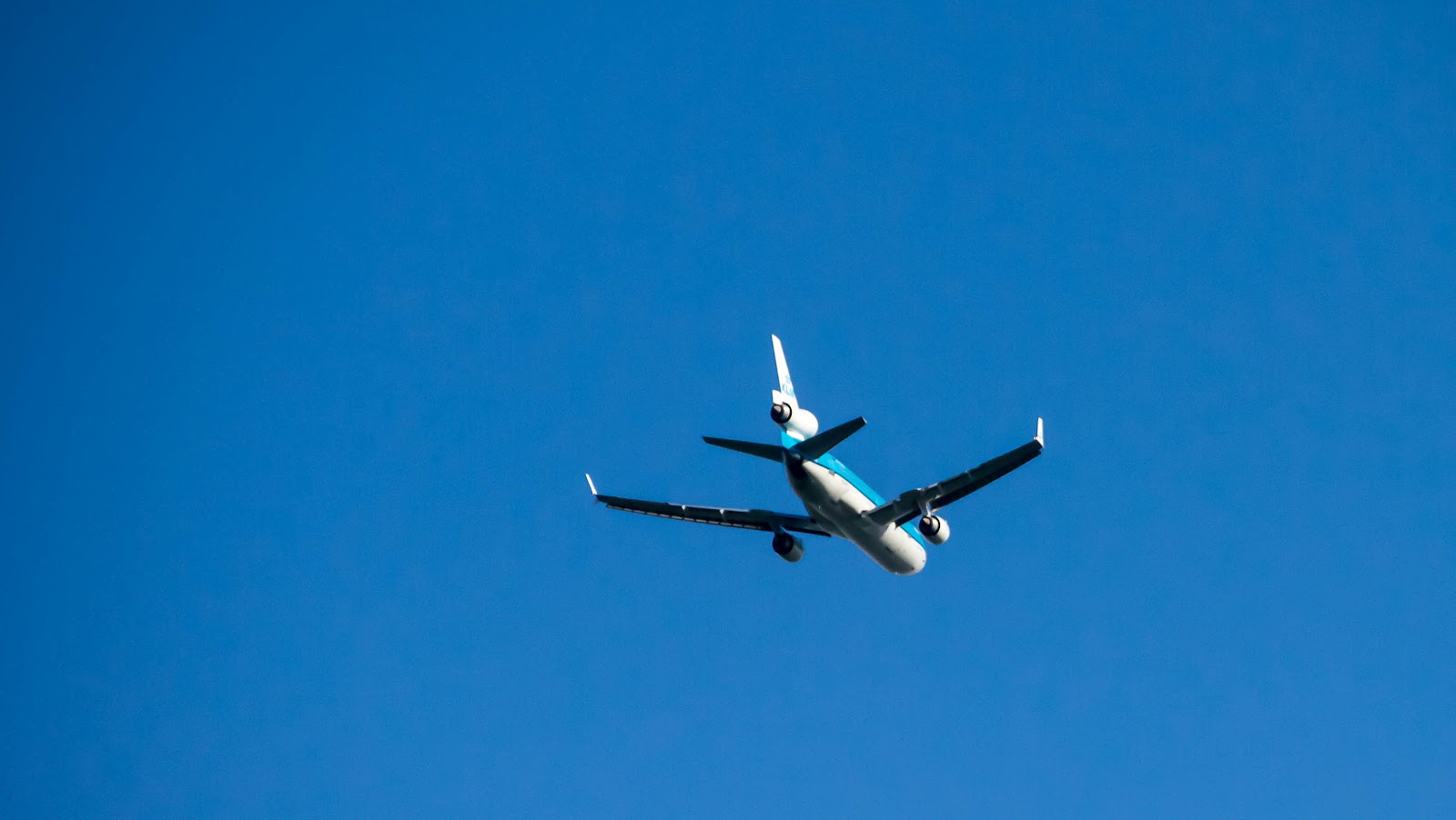

By letting the airplane fly out of my 'frame', picking it up and refocusing a few seconds later, i managed to keep the crisp detail, while at the same time allowing more distance, more space and more context into the image, which, in my opinion, makes it a lot more interesting


Here three other images i took recently, that have definitely improved by allowing more space into the frame. First the fluffy white seed head of a thistle, surrounded by green grass and red clover. Second the silhouette of a cormorant, resting upon a light pole alongside the ice rink. Third is a young boy walking away from the mall with a candy bar.

Here is the thistle seed head again, this time it's a close up with a shallow DoF that makes it stand out from the background, emphasizing the details of the seed head, especially the tiny dewdrops clinging to the fluff. Instead of allowing more space by creating distance while maintaining the detail, like i did with the airplane, here i have achieved the same effect by moving closer and enhancing the detail by decreasing the DoF.

Here i allowed more space into the frame by choosing a horizontal perspective, focusing on the cormorant and the top of the light pole, thereby excluding most of the pole itself. By changing my position i managed to include some of the white cloud. Allowing more space around the silhouette increases the contrast, thereby enhancing the impact of the image.


I love these compositions and how you created them!
BeantwoordenVerwijderenThey are all nice for different reasons, but I do love the plane shot and the little boy in red going down the tunnel!
Little boy in the tunnel...just so nice!
BeantwoordenVerwijderenI agree, the space makes a difference in all of these images! Interesting to note you moved from vertical to horizontal compositions too. All of the subjects seems to lean toward vertical, but the horizontal composition allows space and focuses you in on the subject in a different way. Great exploration!
BeantwoordenVerwijderenMooie serie, vind vooral de "paardebloemachtige" PRACHTIG met die dauwdruppels.
BeantwoordenVerwijderenThe last image is my favorite...I love how the image makes me wonder where he is going, and I love how his shadow appears on the wall. This was a fun topic to explore. All of your images are great examples!
BeantwoordenVerwijderenI really like the composition of the boy in the last photo walking along with his candy... and also his shadow!
BeantwoordenVerwijderenWonderful images! I love how you used space to enhance the photos! My favorite is the thistle! Beautiful image with the blurred background!
BeantwoordenVerwijderenStunning images, I love the cormorant, the composition and juxtaposition of light and dark is wonderful.
BeantwoordenVerwijderen